Working with Charts Leave feedback
On this page
A good template layout should reflect the client’s view and the kinds of questions he will ask. Graphics (diagrams and charts) and tabular data are usually combined with the relative weighting depending on the client’s preferences and analytical demands — that provides additional insight into specific trends that may not be evident from simple tabular reports.
It’s possible to use many sorts of charts and graphs in your document template, including line graphs, column charts, bar charts, pie charts, scatter graphs, bubble graphs and others. The Reporting Engine provides a group of special tags to bind the chart to a data source through Chart Series — logically grouped multi-value data elements — that function as wrappers around data that will be displayed, and also associates styles with the data.
To declare a chart that is going to be populated with data dynamically within your template, do the following steps:
Add a chart to your template at the place where you want it to appear in a result document.
Configure the appearance of the chart.
Add required chart series and configure their appearance as well.
Add a title to the chart, if missing.
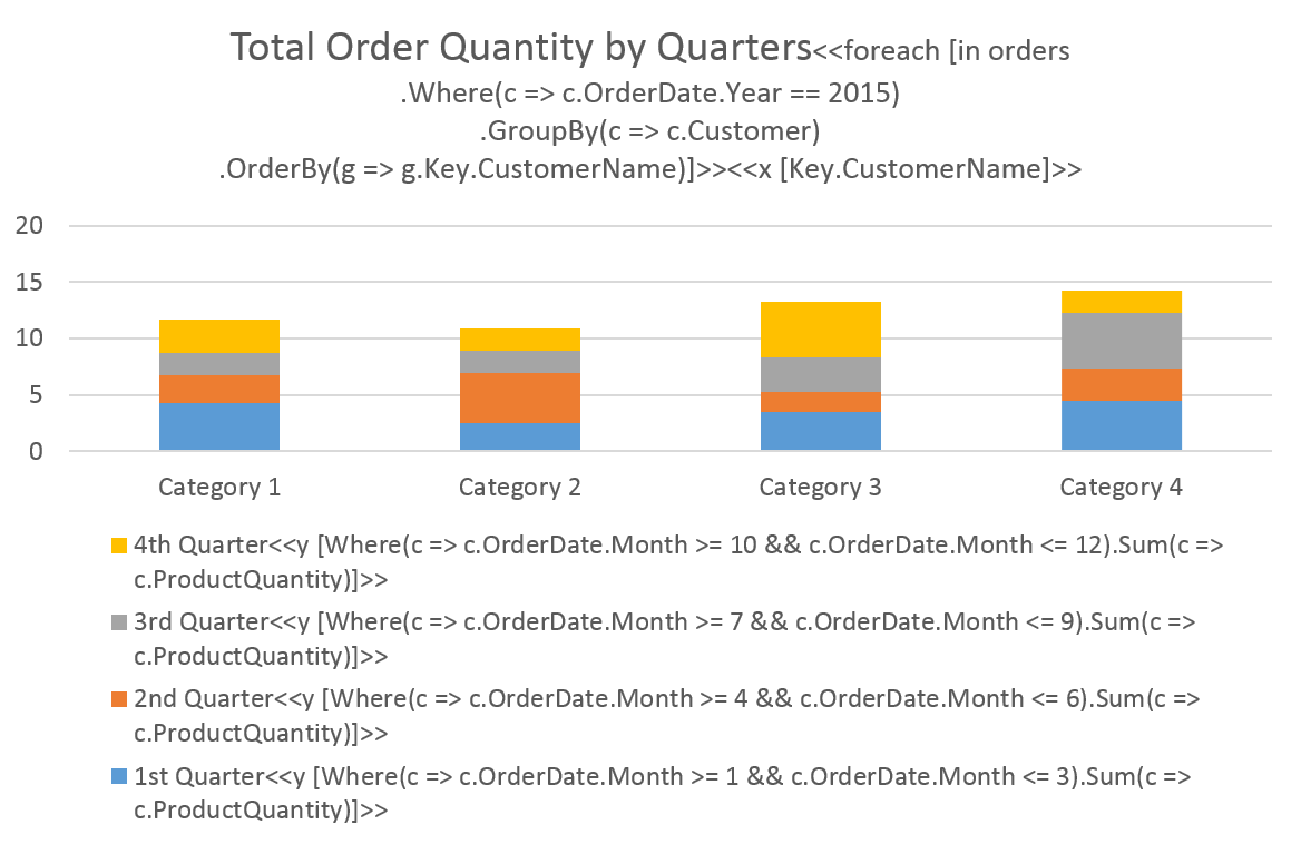
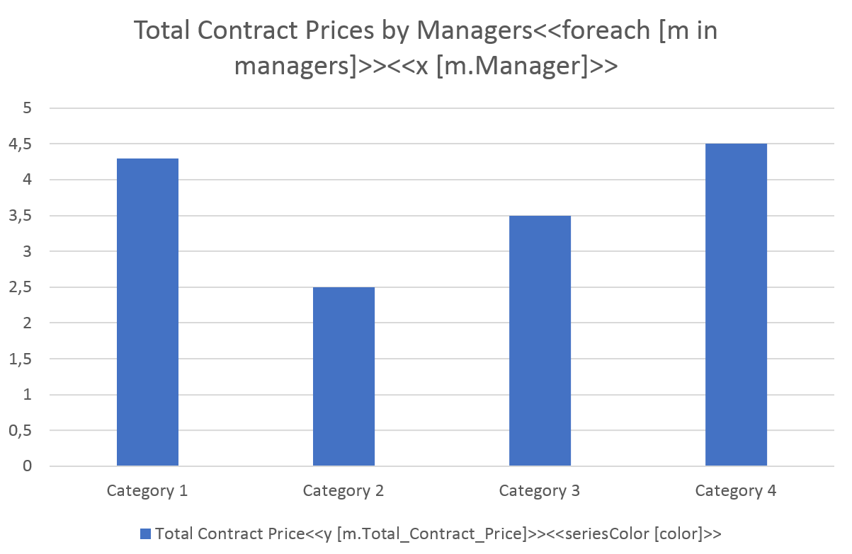
Add an opening
foreachtag to the chart title.Please take note, that a closing
foreachtag is not used for a chart.Depending on the type of the chart, add
xtags to the chart title or chart series’ names as follows:<<x [x_value_expression]>>An
x-valueexpression for a must return a numeric value. To use the samex-valueexpression for all chart series, add a singlextag to the chart title after the correspondingforeachtag. To use differentx-valueexpressions for every chart series, add multiplextags to chart series’ names – one for each chart series.You can use a
sizetag to define the size of bubbles for a Bubble Chart.Depending on the type of the chart, add an
ytags to chart series’ names as follows:<<y [y_value_expression]>>An
y-valueexpression must return a numeric value.
For a complete example of binding data to a chart using x and y tags, please, refer to the “Quick Start” article from the “Getting started” section.
You can normally use common expression tags in chart titles, series names, and axis titles, thus forming their contents dynamically.
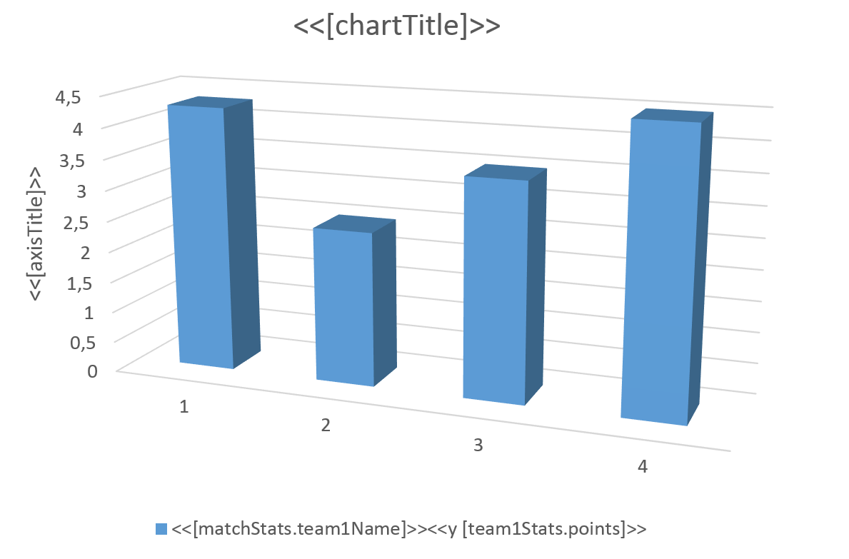
The following chart template demonstrates how to set the chart’s title, series name, and axis title dynamically:
You can select which series to remove from the chart dynamically through the conditional expression. For series to be removed from the chart based upon conditions dynamically, define the conditions in names of these series using removeif tags. During runtime, series with removeif tags, for which conditional expressions return True, are removed from corresponding charts.
The removeif tag syntax is as follows:
<<removeif [conditional_expression]>>
The following template demonstrates how to use the removeif tag to remove a series from a chart:
To work with colors dynamically you need to use Color Expressions. A color expression must return a value of one of the following types:
- A string containing the name of known color, that is, the case-insensitive name of a member of the
KnownColorenumeration such as"red". - An integer value defining RGB (red, green, blue) components of the color such as
0xFFFF00(yellow). - A value of the
Colortype.
For a chart series to be colored dynamically, define the corresponding color expressions in names of these series using seriesColor tag, which has the following syntax:
<<seriesColor [color_expression]>>
The following template demonstrates how to use the seriesColor tag:
You can set colors of an individual chart series points dynamically through the color expression. For a chart series with points to be colored dynamically, define corresponding color expressions in names of these series using pointColor tag, which has the following syntax:
<<pointColor [color_expression]>>
Was this page helpful?
Any additional feedback you'd like to share with us?
Please tell us how we can improve this page.
Thank you for your feedback!
We value your opinion. Your feedback will help us improve our documentation.